How create a UI library with Typescript React and Storybook
 #typescript#react#storybook
TSDX
TSDX is a project by Jared Palmer which includes the best practices and
optimizations for modern NPM packages baked into it. To quote the website:
TSDX is a zero-config CLI that helps you develop, test, and publish modern TypeScript packages with ease — so you can focus on your awesome new library and not waste another afternoon on the configuration.
In short, it takes away most of the hassle of setting up a package as stated above. Other than that, it sets up all you need to get your package ready for publishing, as well as giving you a playground for testing out your package with an example repo.
It doesn’t even have to be a component library. TSDX takes care of all the tedious tasks of setting up a new project.
TSDX Features
Let's look at some of the features:
-
Zero-config: This means you don't need to do anything to get building. The basic configuration needed is all taken care of for you.
-
Rollup: TSDX uses Rollup (similar to Webpack) under the hood and is automatically setup to export both CommonJS and ESM modules without any configuration.
-
Live Playground: Your new project is set up with a live (React) playground so you can import your project and test it out all in the same place.
-
Jest: Jest is setup so you can start writing tests. Don't forget to test your project.
-
Project Templates: There are project templates like react-with-storybook (this is the one we'll be using) which will setup your project with Storybook and React. You can create your library and immediately start developing in Storybook.
-
Tree shaking: Tree shaking is a term commonly used in the JavaScript context for dead-code elimination. Projects using ES modules and modern bundlers, will drop any code they aren't using. For instance, if they only use one component in our library, the rest of the code wont be included at the app level.
TSDX is also customizable, so if your project needs some special configuration you can always override default functionality, see more here. If you want to read more about TSDX you can check out the docs here.
Bootstrapping a New Project
Like I’ve mentioned before, all you need to get started with it is one terminal command:
1 npx tsdx create my-component-library
After running this command a new folder will have been created with the name
my-component-library and all the relevant packages will have been installed.
Once that step has finished, a prompt will appear in the terminal asking to
choose a template:

Choose react-with-storybook. After doing so, all Storybook related packages
will be installed as well:

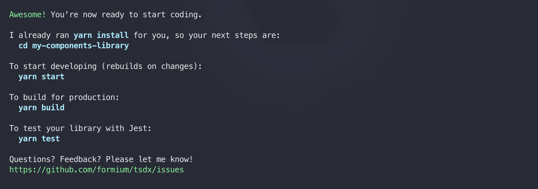
Once it finishes, a confirmation with the basic command will appear:

Open the project in your favorite editor. You’ll notice that you’ve been given a pretty standard folder structure from TSDX. Let's take a look at it:
-
.github: This folder is generated by Github actions which is used to automate your workflows. I definitely recommend reading about them.
-
.storybook: Your Storybook configuration lives here. We'll be using this a bit later on but if you want to learn more you can check out the setup docs here.
-
dist: This is where our bundled code will live. It is where TSDX will output the ES modules, CommonJS modules, our source maps, and all our Typescript types.
-
example: This is the Live Playground piece I described above. It will not be part of the bundle and will not be published.
-
node_modules: All your npm packages go here.
-
src: This is where you will build all your components. This is the main folder that will be compiled to our
distfolder. -
stories: This is where your stories will live for Storybook. Storybook is an open source tool for building UI components and pages in isolation. It streamlines UI development, testing, and documentation.
-
test: This is where we will put all our component tests. I won't be going into writing tests for components in this article, however I highly recommend reading more about how to write tests for components using React Testing Library.
-
package.json - our project dependencies, scripts, configuration, etc.
-
gitignore - files and folders that will be ignored by git.
-
LICENSE - MIT license is automatically generated.
-
README.md - This is a pretty straight forward readme by TSDX. It has all the commands that are generated with their package. I recommend updating this to suite your package needs.
-
tsconfig.json: The TypeScript configuration file that was generated by TSDX. Unless you need some specific configuration I would leave this alone. If you want to learn more about it you can read more here.
As a quick test I like to try out the commands and see them working. Let's start with a quick build:
1 yarn build # or npm run build
Take a look at the dist folder. You can see the ESM, CJS, source maps, and Typescript types all there. That seems to be working as expected.
Out of the box, TSDX has created one component for us, which we can see in our local running Storybook:
1 yarn storybook # or npm run storybook
This loads the stories from ./stories. Storybook should start and open up in
your browser.

Proposed Development Workflow
After we’ve got our package and repo all configured, let’s see how we develop a new component. We’ll start off by creating a new component, a button for example. As we’ve learned from the section above, the right place to start off is our src directory, in it we'll create a new file:
1// src/Button.tsx
2
3import React from 'react';
4
5export interface ButtonProps
6  extends React.ButtonHTMLAttributes<HTMLButtonElement> {
7  label: string;
8}
9
10export const Button: React.FC<ButtonProps> = ({
11  disabled,
12  label,
13  ...props
14}) => {
15  return (
16    <button
17      style={{
18        padding: '.75rem 1.5rem',
19        backgroundColor: 'lightblue',
20        border: '1px solid lightblue',
21        borderRadius: '99999px',
22        fontSize: '1.1rem',
23        cursor: disabled ? 'not-allowed' : 'pointer',
24      }}
25      disabled={disabled}
26      {...props}
27    >
28      {label}
29    </button>
30  );
31};
Now, let’s add a story for it using Storybooks recommend way to write stories follow the “Component Story Format (CSF)”, so we can see what we’ve created:
1// stories/Button.stories.tsx
2
3import React from 'react';
4import { Meta, Story } from '@storybook/react';
5import { Button, ButtonProps } from '../src/Button';
6
7export default {
8  title: 'Components/Button',
9  component: Button,
10  argTypes: {
11    onClick: { action: 'clicked' },
12    label: {
13      control: {
14        type: 'text',
15      },
16    },
17    disabled: {
18      control: {
19        type: 'boolean',
20      },
21    },
22  },
23  parameters: {
24    controls: { expanded: true },
25  },
26} as Meta;
27
28const Template: Story<ButtonProps> = (args) => <Button {...args} />;
29
30export const Default = Template.bind({});
31Default.args = {
32  label: 'Click me',
33  disabled: false,
34};
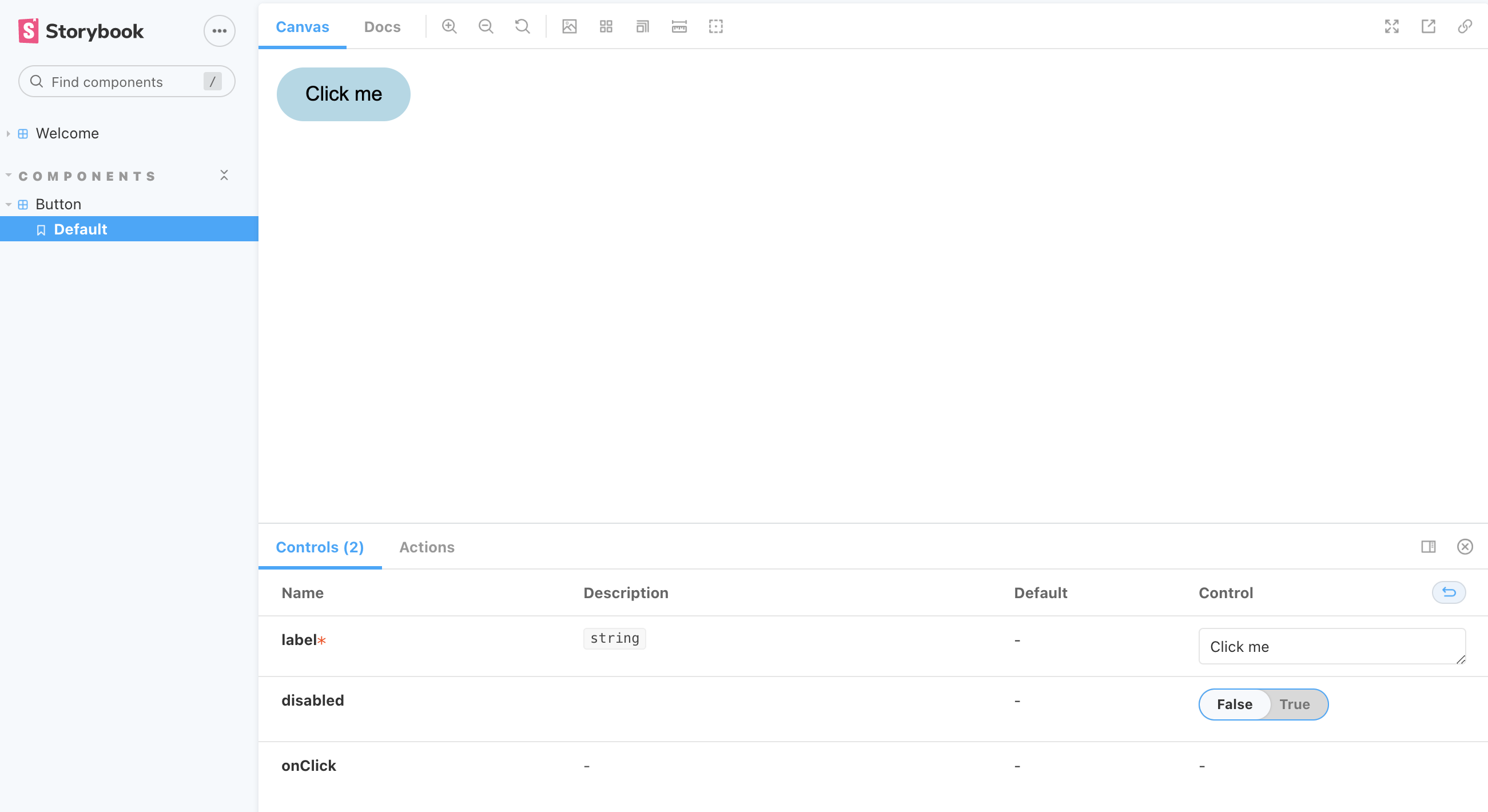
Next, we’ll spin up Storybook, by running yarn storybook from the root folder of our project. And there we have our newly created component:

If you need make some changes, because our Storybook dev server is running, all we need to do is save our changes, and voila! The component will be updated!
Playground
We have a look at our playground with the example project in our directory. Let’s open up index.tsx:
1// /example.index.tsx
2
3import * as React from 'react';
4import 'react-app-polyfill/ie11';
5import * as ReactDOM from 'react-dom';
6import { Thing } from '../.';
7
8const App = () => {
9  return (
10    <div>
11      <Thing />
12    </div>
13  );
14};
15
16ReactDOM.render(<App />, document.getElementById('root'));
We can see that the TSDX example component is imported there and rendered in the App. We can now run this by installing our dependencies:
1  cd example
2  yarn # or npm i
and running the project with:
1 yarn start # or npm run start
⚠️ Note: while trying to run this for the first time I encountered an error in which
parcel(which runs the example app) did not work. The quick fix for this ischanging the devDependencies for parcel and pining it to 1.12.3 (remove the ^ symbol).More info can be found here.
We should see the demo component rendering on localhost:1234:

So if we want to add or test our component without storybook, we can just import our components here, install the necessary dependencies, and render it.
1// /example.index.tsx
2
3import * as React from 'react';
4import 'react-app-polyfill/ie11';
5import * as ReactDOM from 'react-dom';
6import { Thing } from '../.';
7import { Button } from '../src/Button';
8
9const App = () => {
10  return (
11    <div>
12      <Thing />
13      <Button label="Click me" disabled={false} />
14    </div>
15  );
16};
17
18ReactDOM.render(<App />, document.getElementById('root'));

Conclusion
I hope that this post has helped you understand how and why you would want to use TSDX and Storybook.
The way I see it, Storybook one of the best tools to rapidly develop UI, paired with TSDX, It’s never been easier to ship reusable UI component packages and libraries.